写在前:自定义头部标题栏,并封装引用到需要的页面。
实现单页面可用自定义头部(未封装)
首先:根据小程序文档 顶配置项 在需要自定义的页面的json文件中添加下面的配置
{ "navigationStyle": "custom"}其次:为适配各手机顶部状态栏高度高度不同,动态获取高度并存放在全局变量中(放到app.js中)
App({ onLaunch: function() { }, globalData: { statusBarHeight: wx.getSystemInfoSync()['statusBarHeight'], }})之后:布局,(注:因为浮动的元素不占位置,所以用空标签来占位置,当然也可以清除浮动的元素带来的影响)
<view class="topbar" style="padding-top:{{statusBarHeight}}px"> <view class="arrow-box row"> <image src="../image/mine_back.png"></image> </view> <view class="input-box row"> <input placeholder="请输入你想找的内容" /> </view></view><view class="top-comend" style="padding-top:{{statusBarHeight}}px"></view><view>这是测试</view>之后:样式(注:因为设置的是px,效果不是很完美,需自调)
.topbar { width: 100%; height: 45px; /* background-color: pink; */ position: fixed; top: 0; left: 0; z-index: 999;}.row { display: flex; justify-content: center; align-items: center;}.arrow-box { width: 10%; height: 100%; /* background-color: #fe6969; */ float: left;}.arrow-box image { width: 14px; height: 16px; transform: rotateY(180deg);}.input-box { width: 52%; height: 100%; /* background-color: #eee; */ justify-content: center; align-items: center; float: left; margin-left: 3%;}.input-box input { font-size: 12px; color: #333; width: 93%; height: 30px; background-color: #f2f2f2; border-radius: 44rpx; padding-left: 7%;}.top-comend { width: 100%; height: 45px;}最后:因为头部状态栏高度是动态获取的,所以需要单页面引用全局变量
const app = getApp()Page({ data: { statusBarHeight: app.globalData.statusBarHeight },/** * 生命周期函数--监听页面加载 */ onLoad: function () { // console.log(app.globalData.statusBarHeight); },})以上是单页面内单独写,以下写成一个自定义组件,各需要的单页面可引用
根据 小程序自定义组件 封装,自定义组件引用
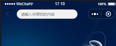
示意图:背景图通栏
首先,我们新建四个文件, my-component.js、my-component.json、my-component.wxml、my-component.wxss,
放到文件夹components里,
之后,my-component.wxml:布局
<!-- 这是自定义组件的内部WXML结构 --><view class="topbar" style="padding-top:{{statusBarHeight}}px"> <view class="arrow-box row"> <image src="../image/mine_back.png"></image> </view> <view class="input-box row"> <input placeholder="请输入你想找的内容" /> </view></view><!-- <view class="top-comend" style="padding-top:{{statusBarHeight}}px"></view> -->之后:my-component.wxss:样式
.topbar { width: 100%; height: 45px; /* background-color: pink; */ position: fixed; top: 0; left: 0; z-index: 999;}.row { display: flex; justify-content: center; align-items: center;}.arrow-box { width: 10%; height: 100%; /* background-color: #fe6969; */ float: left;}.arrow-box image { width: 14px; height: 16px; transform: rotateY(180deg);}.input-box { width: 52%; height: 100%; /* background-color: #eee; */ justify-content: center; align-items: center; float: left; margin-left: 3%;}.input-box input { font-size: 12px; color: #333; width: 90%; height: 30px; background-color: #f2f2f2; border-radius: 44rpx; padding-left: 7%; padding-right: 3%;}.top-comend { width: 100%; height: 45px;}之后:在自定义组件的 js 文件中,需要使用 Component() 来注册组件,并提供组件的属性定义、内部数据和自定义方法。
const app = getApp()Component({ properties: { // 这里定义了innerText属性,属性值可以在组件使用时指定 innerText: { type: String, value: 'default value', } }, data: { statusBarHeight: app.globalData.statusBarHeight, // 这里是一些组件内部数据 someData: {} }, methods: { // 这里是一个自定义方法 customMethod: function () { } }})之后:声明这是组件 自定义组件
{ "component": true}以上都是自定义组件各页面,以下是对组件的调用
当前,(我的页面时index.wxml)布局页面调用
<view> <component-tag-name inner-text="Some text"></component-tag-name></view><view class="ceshi"></view>当前,(我的页面index.wxss)样式页面编写
page { width: 100%; height: 100%;}.ceshi { width: 100%; height: 100%; background-image: url(http://img2.imgtn.bdimg.com/it/u=514294704,4187138556&fm=15&gp=0.jpg); background-position: center; background-repeat: no-repeat; background-size: 100% 100%; -moz-background-size: 100% 100%;}当前,(我的页面index.json)配置页面 (注:"/components/my-component" 路径是我的页面路径配置,与index同级)
{ "navigationStyle": "custom", "navigationBarTextStyle": "white", "usingComponents": { "component-tag-name": "/components/my-component" }}当前,(我的页面index.js),因为没有组件通讯(现阶段),所以省略此页面
基本实现自定义页面,后期会继续记录,以免自己忘记