微信小程序的自定义组件component
本文纯属自创,转载请注明出处
最近Android这边没有什么项目,而公司又开展了小程序项目,自己摸索着摸索着也就会写了一些。在界面编写的时候总是会有同一个布局反复使用的情况,那么使用过小程序的人都知道小程序有模板一说,所以大部分的人都选择了模板来使用。但是模板具有一定的局限性,我们只能实现界面上的复用,那么逻辑上的那些可以通用的地方怎么办呢?
比如说最近在我的项目里面就有用到类似与Android的tabhost的功能组件,起初的时候我们都是挨着挨着的写布局。用到了就写一次用到了就写一次,这样子不仅不方便还会占用很多的开发时间,于是在翻看小程序文档的时候我看见了自定义组件,所以在开发之余我就去研究自定义组件去了。下面给大家简单的分享一下,我的成果。
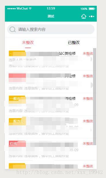
以上是效果图,可以切换tab,下面的页面联动,当然因为自己项目的需要,我自己加了一个搜索布局。因为只是测试一下,所以布局不是很精细,见谅。
如果不会小程序的建议先去官方看看文档,后续有时间我会详细介绍小程序的编写,以及微信开发者工具的使用。
这是我的项目结构

我把自定义的组件写在custom文件夹下的,从上面的结构图可以看到,我的组件tabhost下面的文件和page是很像的,其实就是一样的。 首先我们来看看我的布局 <view class='title-view'> <view class='search-view'> <view class='search'> <image mode='aspectFit' src='/images/icon_search.png'></image> <input placeholder='请输入搜索内容'></input> </view> </view> <view scroll-x class='tab-view'> <block wx:for="{{tabList}}" wx:key='unique'> <view class="{{index == currTab?'active':''}}" data-index='{{index}}' bindtap='changeTab'>{{item.title}}</view> </block> </view></view><swiper class='content-view' duration='300' current='{{currTab}}' bindchange='changeSwiper'> <block wx:for='{{tabList}}' wx:key='unique'> <swiper-item> <scroll-view scroll-y class='scroll-view' onLoadMore='10px' upper-threshold='10px' bindscrolltolower="loadMore" bindscrolltoupper="refresh" data-page-num='{{index}}'> <slot name="{{item.title}}"></slot> <view class="weui-loadmore" wx:if='{{!item.isLoadMore}}'> <view class="weui-loading"></view> <view class="weui-loadmore__tips">正在加载</view> </view> <!-- <view class="weui-loadmore weui-loadmore_line"> <view class="weui-loadmore__tips weui-loadmore__tips_in-line">不要拉了,没有啦~</view> </view> --> <view class='no-more' wx:if='{{item.isLoadMore}}'><view></view><text>不要拉了,没有啦~</text><view></view></view> </scroll-view> </swiper-item> </block></swiper> 然后是我的样式
/* custom/tabhost/tab_host.wxss */@import "/common/weui-loading.wxss";.title-view { width: 100%; height: 18%; background-color: white; position: fixed; z-index: 999; font-size: 32rpx; box-sizing: border-box;}.content-view { width: 100%; height: 82%; min-height: 82%; position: absolute; box-sizing: border-box; top: 18%}.search-view { display: flex; height: 60%; border-bottom: 1rpx solid #eee; box-sizing: border-box; align-items: center; justify-content: center;}.search-view .search { display: flex; height: 80rpx; width: 90%; background-color: #eff0f2; border-radius: 40rpx; align-items: center; padding: 0 20rpx;}.search-view .search image { width: 50rpx; height: 50rpx; margin-right: 20rpx;}.tab-view { height: 40%; display: flex; flex: 1; box-sizing: border-box; justify-content: space-around;}.tab-view view{ position: relative; display: inline-block; padding: 20rpx;}.tab-view view.active{ color: #fd6067;}.tab-view view.active::after{ content: ""; position: absolute; width: 36%; margin: 0px auto; background-color: #fd6067; height: 5rpx; border-radius: 3rpx; left: 32%; bottom: 0;}.scroll-view{ height: 100%;}.no-more{ display: flex; width: 100%; height: 100rpx; line-height: 100rpx; text-align: center; color: #ddd; font-size: 32rpx; letter-spacing: 0px; justify-content: center; align-content: center; align-items: center;}.no-more view{ width: 100rpx; height: 1rpx; background-color: #ddd;}.no-more text{}额。。。。。对了我还加了个功能,加载更多和下拉刷新。上图: 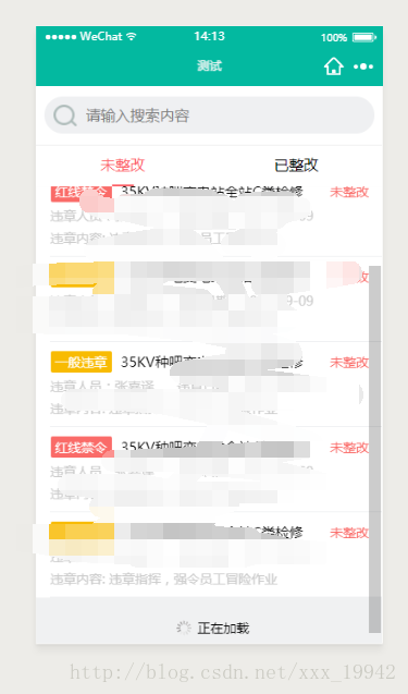
weui-loading.wxss的样式请看wxui开源组件样式,这个在GitHub上一搜就有了,这个就是加载更多那个样式。
在自定义组件的时候有个很重要的就是一定要在组件的json文件中添加一句:
{ "component": true}接下来就是很重要的js文件了,先看源码:
Component({ options: { multipleSlots: true // 在组件定义时的选项中启用多slot支持 }, properties: { tabList: { type: Array, value: [], }, currTab: { type: Number, value: 0, }, isRefresh:{ type: Boolean, value:false, }, isLoadMore: { type: Boolean, value: false, } }, data: { // 这里是一些组件内部数据 someData: {}, showBottom: true, emptyString:'暂无相关数据', noMoreString:'不要拉了,没有啦~', }, methods: { // 这里是一个自定义方法 customMethod: function () { }, changeSwiper: function (e) { var myEventDetail = { index: e.detail.current } // detail对象,提供给事件监听函数 // var myEventOption = { } // 触发事件的选项 this.triggerEvent('onPageChange', myEventDetail) this.setData({ currTab: e.detail.current }) }, changeTab: function (e) { this.setData({ currTab: e.currentTarget.dataset.index }) //currtab改变之后会触发swiper的change事件,所以不用在加onPageChange事件 }, loadMore: function (e) { let pageNum = e.currentTarget.dataset.pageNum if (this.data.tabList[pageNum].isLoadMore == true){ //防止重复响应加载事件 return } // this.data.tabList[pageNum].isLoadMore = true // this.setData({ // tabList: this.data.tabList // }) var myEventDetail = { pageNum: pageNum, isLoadMore: true } // detail对象,提供给事件监听函数 this.triggerEvent('onLoadMore', myEventDetail) }, refresh: function (e) { let pageNum = e.currentTarget.dataset.pageNum if (this.data.tabList[pageNum].isRefresh == true) { //防止重复响应刷新事件 return } // this.data.tabList[pageNum].isRefresh = true // this.setData({ // tabList: this.data.tabList // }) var myEventDetail = { pageNum: pageNum, isRefresh: true } this.triggerEvent('onRefresh', myEventDetail) }, },})-
小程序