小程序页面可以使用类似于html的方式进行设计,鉴于小程序主要适用于移动端,所以推荐使用flex的响应式布局。
定义布局 display:flex
flex容器的属性
- flex-direction:排列方向
- row:默认横向排列
- row-reverse :横向排列倒序
- colunm:纵向排列
- column-reverse:纵向排列倒序
- flex-wrap:换行规则
- nowrap:不换行(当元素宽度超过容器宽度,将元素宽度进行平均压缩地不换行处理方式)
- wrap:默认换行
- wrap-reverse:从下往上换行
- justify-content:对齐方式
- flex-start 默认向左对齐
- flex-end 向右对齐
- center 向中间对齐
- space-around 所有元素周围都被空白包围
- space-between 除了最边缘的元素以外 其他元素都被空白包围
- order:手动排序
- flex:元素所占宽度的比值
- flex-direction:排列方向
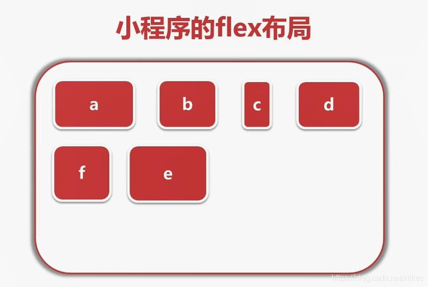
例子
- wxss代码
/* pages/index/index.wxss */.container{ display: flex; /* flex-direction:column; 横纵排序设置*/ /* flex-wrap: wrap-reverse; 换行规则*/ /* justify-content: center; 对齐方式*/}.size{ width: 150rpx; height: 150rpx;}.a{ background-color: red; order: 1; flex: 2;}.b{ background-color:yellow; order: 2; flex: 1;}.c{ background-color:rgb(174, 174, 182); order: 3; flex: 1;}.d{ background-color:orange; order: 5; flex: 1;}.e{ background-color: green; order: 4; flex: 1;} - wxml代码
!--index.wxml--view class="container" view class='a size'a /view view class='b size'b /view view class='c size'c /view view class='d size'd /view view class='e size'e /view /view - 显示效果

- wxss代码