微信小程序中动画的水还是比较深的
这只是简单介绍下小程序中动画的一些属性和注意事项,
做动画前一定要整理好思路
将动画一步步分解,再进行组合!这里只做引入。
wx.createAnimation(object)
官方介绍:
1.创建动画实例animation:
调用动画实例方法来描述动画。最后将动画export导出,把动画数据传递组件animation的属性
eg:
Page({ /** * 页面的初始数据 */ data: { animation:'' }, onReady: function () { // 页面渲染完成 // 实例化一个动画 this.animation=wx.createAnimation({ // 动画持续时间 单位ms 默认 400 duration:1000, /** * http://cubic-bezier.com/#0,0,.58,1 * linear 动画一直较为均匀 * ease 从匀速到加速在到匀速 * ease-in 缓慢到匀速 * ease-in-out 从缓慢到匀速再到缓慢 * * http://www.tuicool.com/articles/neqMVr * step-start 动画一开始就跳到 100% 直到动画持续时间结束 一闪而过 * step-end 保持 0% 的样式直到动画持续时间结束 一闪而过 */ timingFunctionL:'linear', // 延迟多长时间开始 delay:100, /** * 以什么为基点做动画 效果自己演示 * left,center right是水平方向取值,对应的百分值为left=0%;center=50%;right=100% * top center bottom是垂直方向的取值,其中top=0%;center=50%;bottom=100% */ transformOrigin:'left top 0', success:function(res) { console.log(res) } }) },最后将动画export导出,把动画数据传递组件animation的属性
this.setData({ animation:this.animation.export())}2.调用动画方法后,要调用step()表示一组动画完成,
可在一组动画中调用N多动画方法,动画中所有动画会同时开始,一组完成后才会进行下一组
/** *单个动画组 旋转*/ rotate: function () { // 顺时针旋转10度 this.animation.rotate(150).step(); this.setData({ // 输出动画 animation: this.animation.export() }) }3.step()内可传跟wx.createAnimation()一样的配置参数,指定当前组动画属性
4.缩放动画组和旋转动画组通过step()连接,顺序执行
/** *多个动画组 旋转 */ rotate: function () { // 两个动画组 一定要以step()结尾 /** *动画顺序 顺时针旋转150度 * x,y 放大二倍, * x,y 平移10px * x ,y顺时针倾斜 改变样式 和 设置高度 宽度 */ this.animation.rotate(150).step().scale(2).step().translate(10).step().skew(10) .step().opacity(0.5).width(10).step({ ducation: 8000}) this.setData({ //输出动画 animation: this.animation.export() }) }动画主要属性:
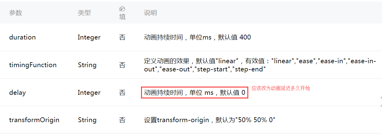
timingFunction 设置动画效果
- linear 默认为linear 动画一直较为均匀
- ease 开始时缓慢中间加速到快结束时减速
- ease-in 开始的时候缓慢
- ease-in-out 开始和结束时减速
- ease-out 结束时减速
- step-start 动画一开始就跳到 100% 直到动画持续时间结束 一闪而过
- step-end 保持 0% 的样式直到动画持续时间结束 一闪而过
transformOrigin设置动画的基点 默认50% 50% 0
- left,center right是水平方向取值,对应的百分值为left=0%;center=50%;right=100%
- top center bottom是垂直方向的取值,其中top=0%;center=50%;bottom=100%
动画组及动画方法 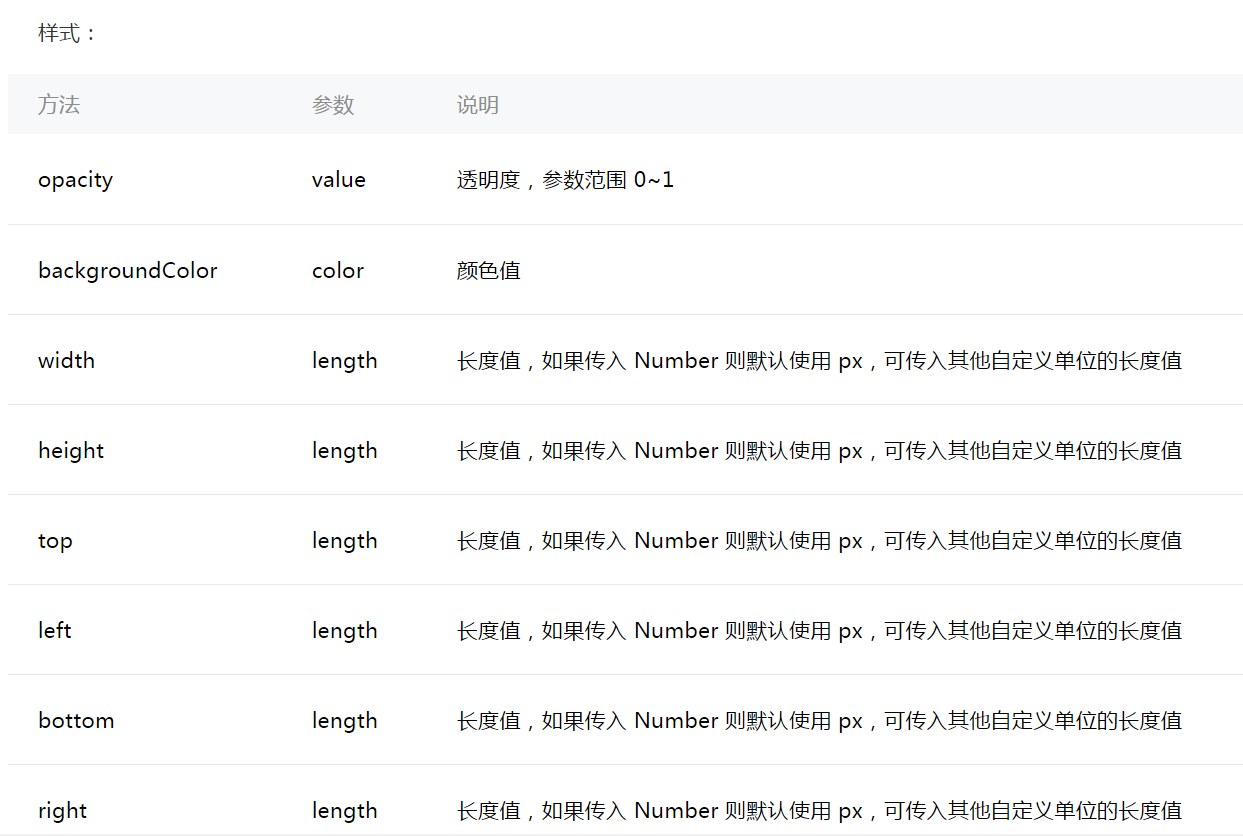
旋转: 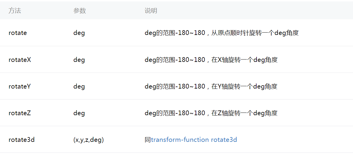
缩放 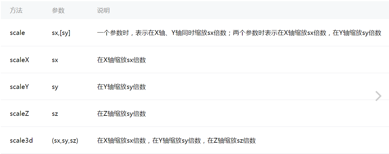
偏移 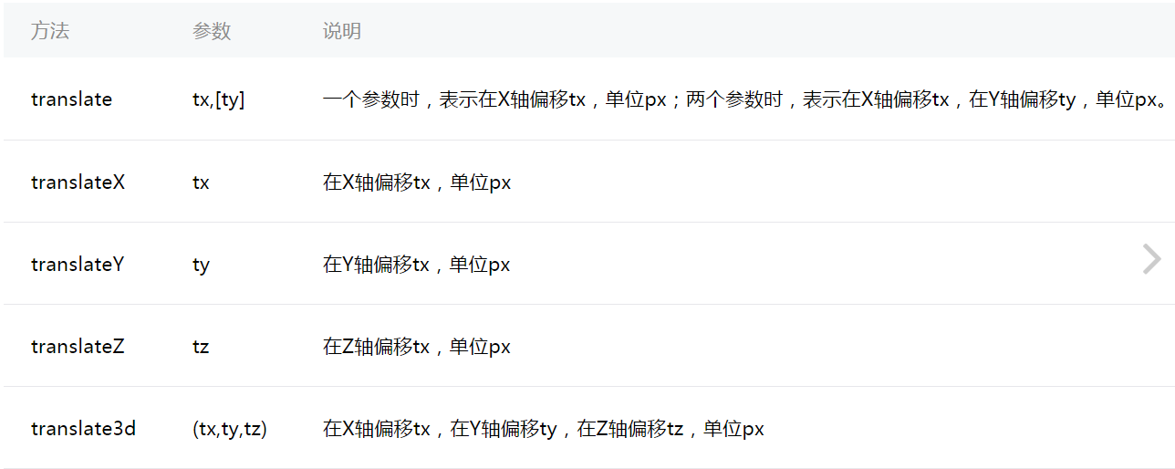
倾斜
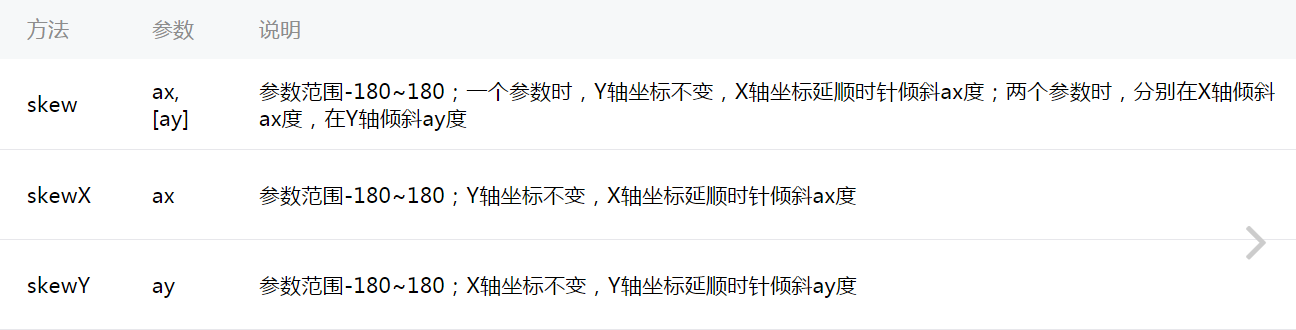
单个动画组 效果实例
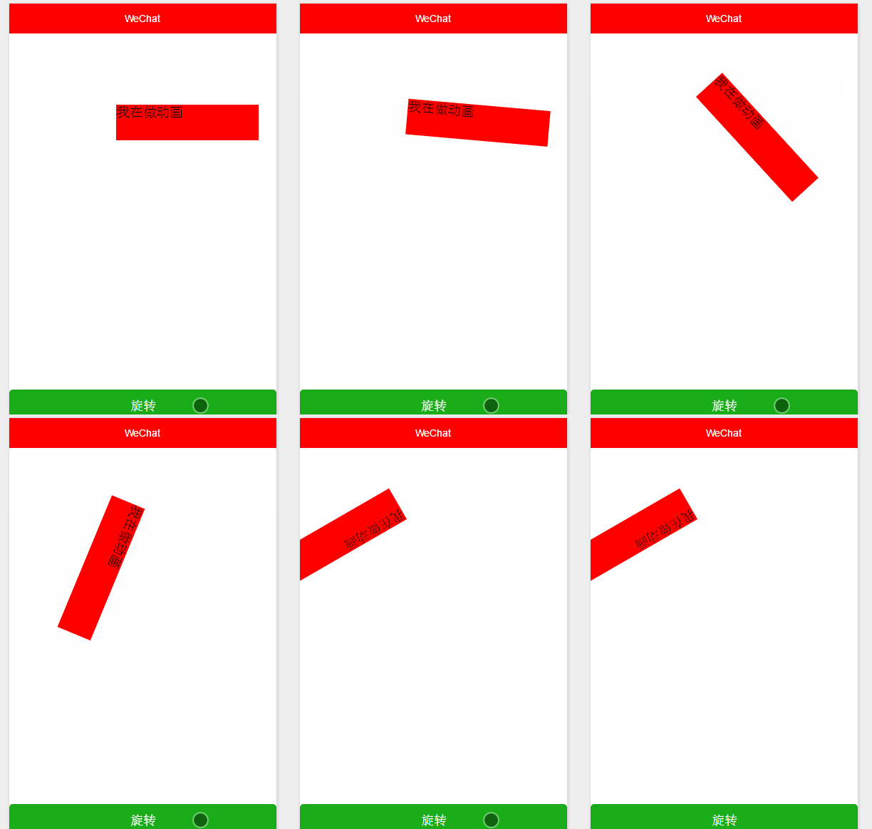
view view animation="{{animation}}" class='animation'我是单个动画组旋转动画/view/viewbutton bindtap='rotate' class='btn' type='primary'旋转一下/button.animation{ width: 400rpx; height: 100rpx; background-color: rgb(202, 66, 66); margin: 200rpx 300rpx;}.btn{ display: flex; justify-content: center; align-items: center; position: absolute; bottom: 10rpx;}Page({ /** * 页面的初始数据 */ data: { animation:'' }, /** * 生命周期函数--监听页面加载 */ onLoad: function (options) { // 页面初始化 options为页面跳转所带来的参数 }, /** * 生命周期函数--监听页面初次渲染完成 */ onReady: function () { // 页面渲染完成 // 实例化一个动画 this.animation=wx.createAnimation({ // 动画持续时间 单位ms 默认 400 duration:1000, /** * http://cubic-bezier.com/#0,0,.58,1 * linear 动画一直较为均匀 * ease 从匀速到加速在到匀速 * ease-in 缓慢到匀速 * ease-in-out 从缓慢到匀速再到缓慢 * * http://www.tuicool.com/articles/neqMVr * step-start 动画一开始就跳到 100% 直到动画持续时间结束 一闪而过 * step-end 保持 0% 的样式直到动画持续时间结束 一闪而过 */ timingFunctionL:'linear', // 延迟多长时间开始 delay:100, /** * 以什么为基点做动画 效果自己演示 * left,center right是水平方向取值,对应的百分值为left=0%;center=50%;right=100% * top center bottom是垂直方向的取值,其中top=0%;center=50%;bottom=100% */ transformOrigin:'left top 0', success:function(res) { console.log(res) } }) }, /** *单个动画组 旋转 */ rotate: function () { // 顺时针旋转10度 this.animation.rotate(150).step(); this.setData({ // 输出动画 animation: this.animation.export() }) }})多个动画组 效果实例
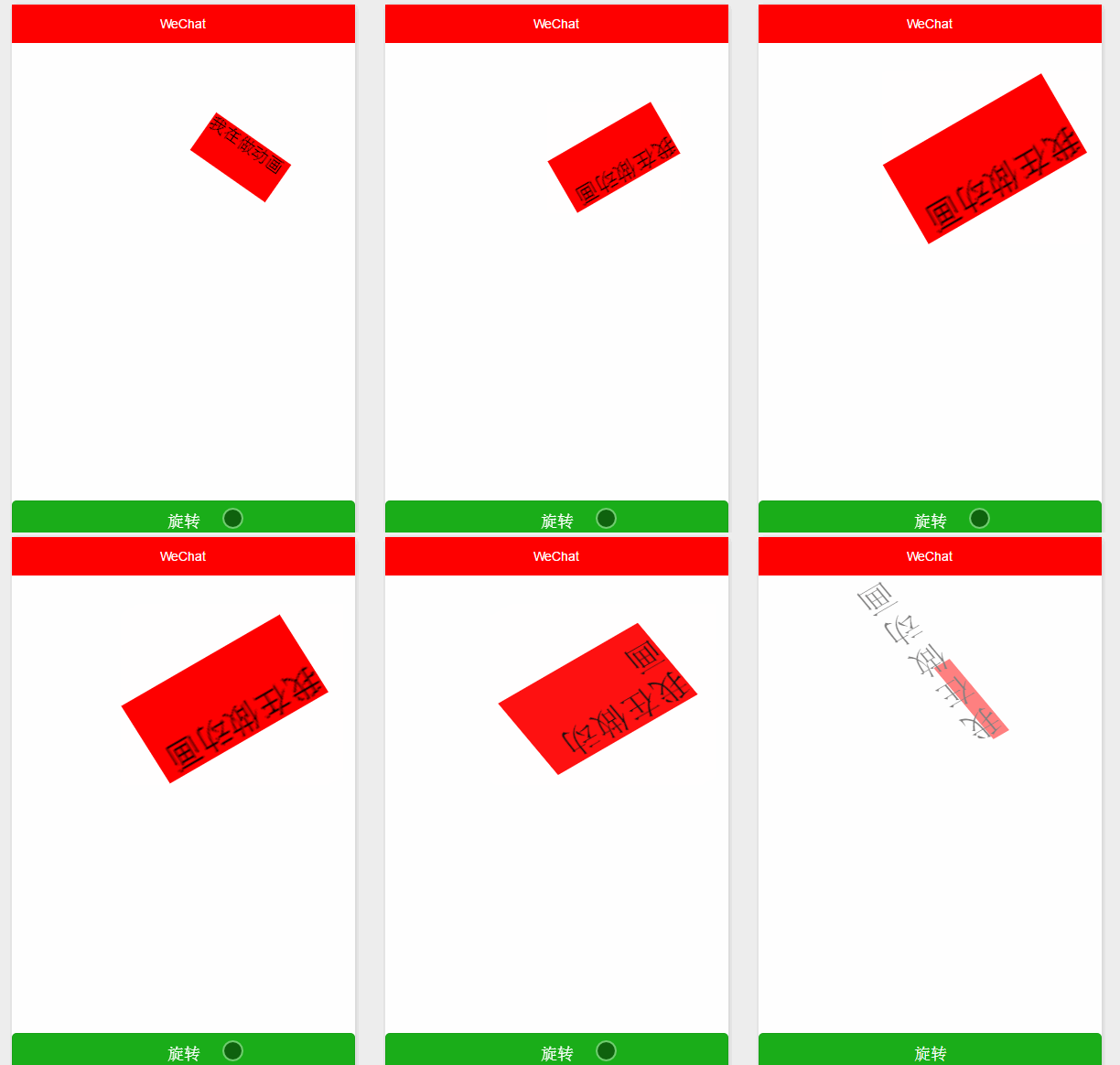
view view animation="{{animation}}" class='animation'我是多个动画组旋转动画/view/viewbutton bindtap='rotate' class='btn' type='primary'旋转一下/button.animation{ width: 400rpx; height: 100rpx; background-color: rgb(202, 66, 66); margin: 200rpx 300rpx;}.btn{ display: flex; justify-content: center; align-items: center; position: absolute; bottom: 10rpx;}Page({ /** * 页面的初始数据 */ data: { animation:'' }, /** * 生命周期函数--监听页面加载 */ onLoad: function (options) { // 页面初始化 options为页面跳转所带来的参数 }, /** * 生命周期函数--监听页面初次渲染完成 */ onReady: function () { // 页面渲染完成 // 实例化一个动画 this.animation=wx.createAnimation({ // 动画持续时间 单位ms 默认 400 duration:1000, /** * http://cubic-bezier.com/#0,0,.58,1 * linear 动画一直较为均匀 * ease 从匀速到加速在到匀速 * ease-in 缓慢到匀速 * ease-in-out 从缓慢到匀速再到缓慢 * * http://www.tuicool.com/articles/neqMVr * step-start 动画一开始就跳到 100% 直到动画持续时间结束 一闪而过 * step-end 保持 0% 的样式直到动画持续时间结束 一闪而过 */ timingFunctionL:'linear', // 延迟多长时间开始 delay:100, /** * 以什么为基点做动画 效果自己演示 * left,center right是水平方向取值,对应的百分值为left=0%;center=50%;right=100% * top center bottom是垂直方向的取值,其中top=0%;center=50%;bottom=100% */ transformOrigin:'left top 0', success:function(res) { console.log(res) } }) }, /** *多个动画组 旋转 */ rotate: function () { // 两个动画组 一定要以step()结尾 /** *动画顺序 顺时针旋转150度 * x,y 放大二倍, * x,y 平移10px * x ,y顺时针倾斜 改变样式 和 设置高度 宽度 */ this.animation.rotate(150).step().scale(2).step().translate(10).step().skew(10).step().opacity(0.5).width(10).step({ ducation: 8000}) this.setData({ //输出动画 animation: this.animation.export() }) },})