前言
微信小程序中,要为用户提供安全密码,用于后续的操作。UI设计稿类似微信的安全密码设置,需要两次输入,验证密码一致。之前刚入坑的时候,就收藏了一些小程序相关的好案例,没有前人铺路,也不会有今天的这篇文章。在此特别鸣谢,NAMECZ的博文(https://blog.csdn.net/namecz/article/details/79892451),文章的思路很巧妙。
正文
项目中多次使用到该模块,因此抽象为一个组件(password-box)来实现。通过对外暴露的属性和方法,达到项目需求。以下附上组件源码,给大家一个参考:
wxml:
view class="password-box" view class='password-wrapper' !-- 伪装的input -- block wx:for="{{inputLength}}" wx:key="item" !-- 宽高可以由外部指定 -- view class="password-item" style="width: {{inputWidth}}; height: {{inputHeight}}" catchtap='_focusInput' !-- 隐藏密码时显示的小圆点【自定义】 -- view wx:if="{{!showValue && currentValue.length=index+1}}" class="hidden"/view !-- 显示密码时显示对应的值 -- view wx:if="{{showValue}}" class="show"{{currentValue.length=index+1?currentValue[index]:''}}/view/view /block /view !-- 隐藏的输入框 -- input type="number" password="{{true}}" value="{{currentValue}}" class='hidden-input' maxlength="{{inputLength}}" focus="{{inputFocus}}" bindinput="_setCurrentValue"/input/viewjs:
Component({ properties: { // 输入框的数量 inputLength: { type: Number, value: 6 }, // 单个输入框的宽度 inputWidth: { type: String, value: '80rpx' }, inputHeight: { type: String, value: '74rpx' }, // 是否显示输入的值,默认隐藏 showValue: { type: Boolean, value: false } }, data: { // input是否获取焦点 inputFocus: false, // 初始input值为空 currentValue: '' }, methods: { // 设置当前的值 _setCurrentValue(e) { // 在此处判断满6(inputLength)位,把值返回给上级父组件或页面 let currentValue = e.detail.value // 改变时,派发一个事件,如果父组件或页面中需要实时获取改变后的值,可以监听这个事件。 this.triggerEvent('change', e.detail.value) this.setData({ currentValue }) if (currentValue.length = this.data.inputLength) { this._complate() return } }, // 点击伪装的input时,让隐藏的input获得焦点 _focusInput() { this.setData({ inputFocus: true }) }, _complate() { this.triggerEvent('inputComplate', this.data.currentValue) }, // 提供给外部调用的方法,显示/隐藏密码。接收一个参数,可以显性修改展示的状态。 toggleValue(state) { this.setData({ showValue: state != undefined ? state: !this.data.showValue }) }, // 清除input当前的值 clearCurrentValue() { this.setData({ currentValue: '' }) } }})wxss:
.password-box .password-wrapper { display: flex; justify-content: center; align-items: center;}.password-box .password-item { position: relative; display: flex; justify-content: center; align-items: center;}.password-box .password-item::after { display: block; content: ''; position: absolute; top: 0; left: 0; border: 1px solid #999; box-sizing: border-box; width: 200%; height: 200%; border-radius: 0rpx; transform: scale(0.5); transform-origin: left top;}.password-box .password-item + .password-item { margin-left: -1rpx;}.password-box .password-wrapper .hidden { width: 14rpx; height: 14rpx; border-radius: 50%; background: #999;}.password-box .password-wrapper .show { color: #087b46;}.password-box .hidden-input { width: 0; height: 0; min-height: 0;}json:
{ "component": true}使用
上面是组件的定义,接下来看看如何在页面(setPassword)中使用它。
wxml:
view class="set-password" view class="tip"{{tipText}}/view !-- 密码框 -- view class="password-wrapper" !-- 使用自定义组件。绑定一个事件,接收组件传递的值 -- password-box id="passwordBox" bind:change="inputChange"/password-box /view !-- 显示/隐藏密码 -- view class="toggle-tip" bindtap="toggleValue" text class="tip {{valueIsShow?'active':''}}"{{valueIsShow?'隐藏密码':'显示密码'}}/text/view !-- 下一步操作按钮 -- view wx:if="{{firstValue==''}}" class="btn-next {{currentValue.length==6?'btn-next-active':''}}" bindtap="saveInputValue"下一步/view view wx:if="{{firstValue!=''}}" class="btn-next {{currentValue.length==6?'btn-next-active':''}}" bindtap="checkPassword"验证/view/viewjs:
Page({ onLoad() { console.log('Page Load...') }, onShow: function() { this.passwordBox = this.selectComponent('#passwordBox') }, data: { tipText: '请输入六位数字密码', // 用于页面样式的 valueIsShow: false, // 记录临时的值,点击按钮后再保存到对应变量中 currentValue: '', firstValue: '', secondValue: '' }, navigatorTo(e) { let url = e.currentTarget.dataset.url wx.navigateTo({ url: url }) }, // 调用组件中的方法 toggleValue() { this.setData({ valueIsShow: !this.data.valueIsShow }) this.passwordBox.toggleValue() }, inputChange(e) { let currentValue = e.detail this.setData({ currentValue }) }, saveInputValue() { let value = this.data.currentValue if (value.length 6) { return } if (this.data.firstValue == '') { // 调用组件中的方法,清除之前的值 this.passwordBox.clearCurrentValue() this.passwordBox.toggleValue(false) // 重置页面初始的数据,以及文案的修改 this.setData({ firstValue: value, currentValue: '', valueIsShow: false, tipText: '请再次确认6位数数字密码' }) } else { this.setData({ secondValue: value }) } }, checkPassword(){ this.saveInputValue() console.log('验证密码...') }})wxss:
.set-password { min-height: 100%; background: #f0f0f0; padding-top: 164rpx; box-sizing: border-box;}.set-password .tip { text-align: center; font-size: 30rpx; color: #666;}.set-password .password-wrapper { margin-top: 47rpx;}.set-password .toggle-tip { margin-top: 18rpx; text-align: center;}.set-password .toggle-tip .tip { font-size: 22rpx; line-height: 22rpx; color: #999;}.set-password .toggle-tip .active { color: #087b46;}.set-password .btn-next { margin: 138rpx auto 0; width: 334rpx; height: 80rpx; line-height: 80rpx; text-align: center; border-radius: 6rpx; color: #fff; background: #9e9e9e;}.set-password .btn-next-active { background: #087b46;}json:
{ "usingComponents": { "password-box": "/components/passwordBox/password-box" }}效果图
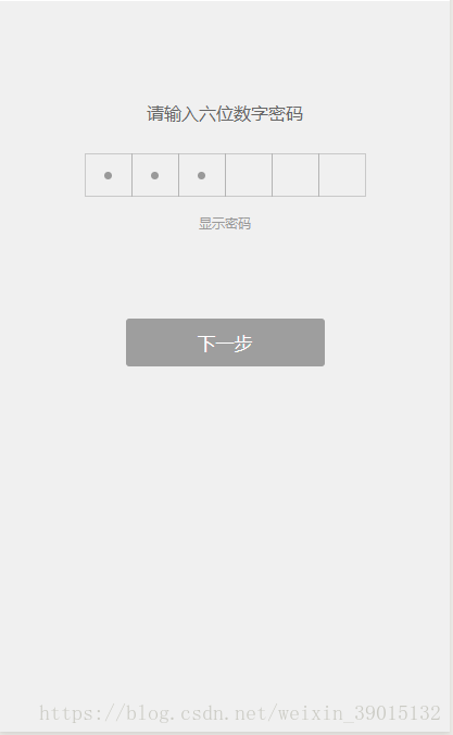
1.首次输入密码
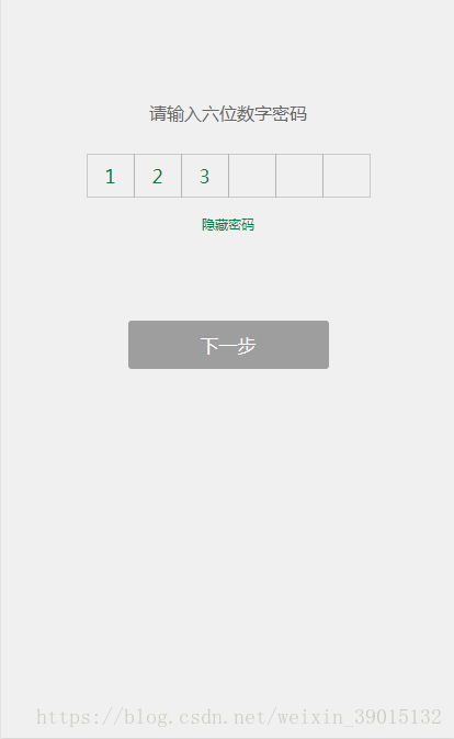
2.显示密码:
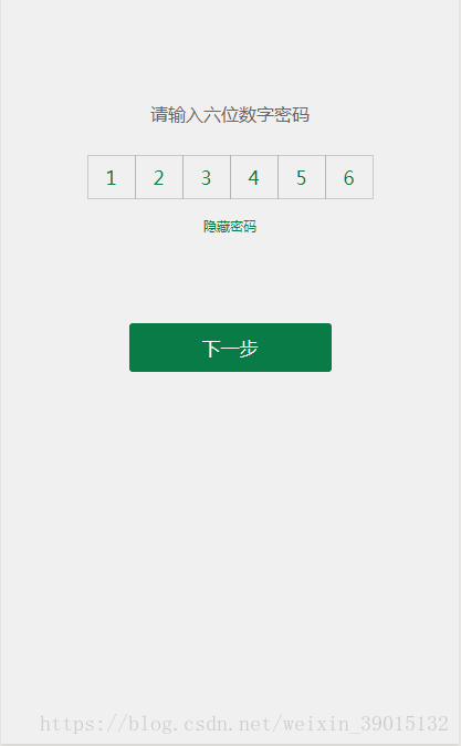
3.首次输入完成:
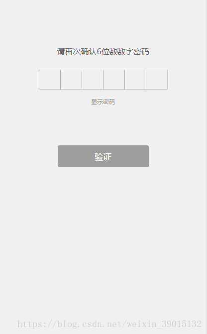
4.再次输入密码:
5.再次输入完成:
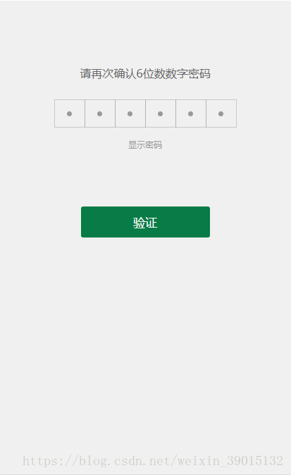
总结
主要总结一下与原作者的不同之处。原文章最最最大的亮点就是用一个input值控制多个虚拟的input,这个思路很巧妙,我一开始拿到设计稿,没有想过这种解决方案。参考了这篇文章才慢慢请清晰,根据自己的需求,设计了一个组件,并记录下来,分享给有类似需求的小伙伴。
原文是使用input设置disabled+value+password控制值的显示和隐藏,但是设计稿与原生的input有些不同。为了方便控制显示与隐藏时的样式,采用view模拟了input。根据showValue判断当前显示的是小圆点还是数值。组件扩展了一些对外属性和方法,使用时也更方便,也可根据自己的需求自定义。
嘘寒问暖 不如打笔巨款~