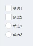
在微信小程序中,checkbox、radio的默认样式如下:
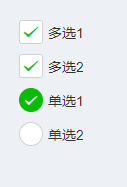
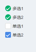
但是有时我们需要改变它的样式,如其他颜色、多项选择为圆圈、单项选择为方框等等。例子如下: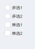
实现如下:
1. checkbox样式
/* 未选中的 背景样式 */checkbox .wx-checkbox-input { width: 35rpx; /* 背景的宽 */ height: 35rpx; /* 背景的高 */ line-height: 35rpx; border-radius: 3px;/* 圆角:border-radius: 50%; */}/* 选中后的 背景样式 */checkbox .wx-checkbox-input.wx-checkbox-input-checked { border: 1rpx solid #04b06d; background: #04b06d; width: 35rpx; /* 背景的宽 */ height: 35rpx; /* 背景的高 */ line-height: 35rpx;}/* 选中后的 对勾样式 */checkbox .wx-checkbox-input.wx-checkbox-input-checked::before { /* border-radius: 50%;圆角 */ width: 35rpx; /* 选中后对勾大小,不要超过背景的尺寸 */ height: 35rpx; /* 选中后对勾大小,不要超过背景的尺寸 */ line-height: 35rpx; text-align: center; font-size: 30rpx; /* 对勾大小 30rpx */ color: #fff; /* 对勾颜色 白色 */ background: transparent; transform: translate(-50%, -50%) scale(1); -webkit-transform: translate(-50%, -50%) scale(1);}效果如下:
如果想要它由方框变成圆形,只需要border-radius: 50%;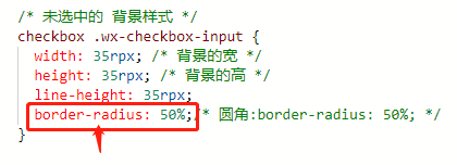
效果如下:

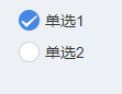
2. radio样式
radio .wx-radio-input{ width: 35rpx; height: 35rpx; line-height: 35rpx; border-radius: 3px;/* 圆角:border-radius: 50%; */}radio .wx-radio-input.wx-radio-input-checked { border: 1rpx solid #4788E5; background: #4788E5; width: 35rpx; /* 背景的宽 */ height: 35rpx; /* 背景的高 */ line-height: 35rpx;}radio .wx-radio-input.wx-radio-input-checked::before { width: 35rpx; height: 35rpx; line-height: 35rpx; text-align: center; font-size: 30rpx; /* 对勾大小 30rpx */ color: #fff; /* 对勾颜色 白色 */ background: transparent; transform: translate(-50%, -50%) scale(1); -webkit-transform: translate(-50%, -50%) scale(1);}效果如下: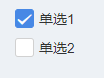
如果想要它由方框变成圆形,只需要border-radius: 50%;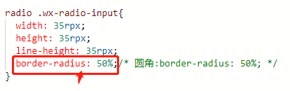
效果如下: