这里的例子采用的Flex布局
方向为column
关键属性
display: flex;
flex-direction
justify-content
align-items
<view class="item">H</view>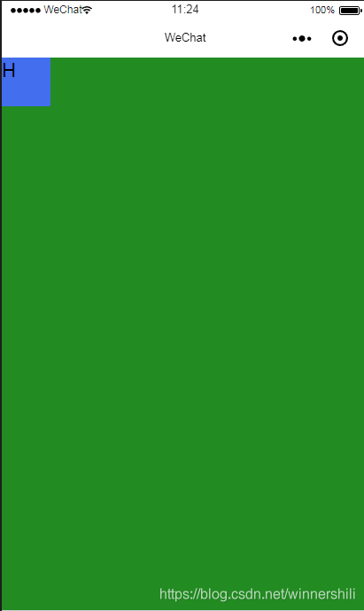
page{ height: 100%; background-color: forestgreen; display: flex; flex-direction: column; justify-content: flex-start;}view{ width: 100rpx; height:100rpx; background: #436EEE;}
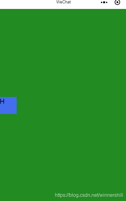
page{ height: 100%; background-color: forestgreen; display: flex; flex-direction: column; justify-content: center;}view{ width: 100rpx; height:100rpx; background: #436EEE;}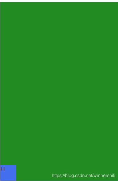
page{ height: 100%; background-color: forestgreen; display: flex; flex-direction: column; justify-content: flex-end;}view{ width: 100rpx; height:100rpx; background: #436EEE;}
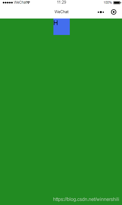
page{ height: 100%; background-color: forestgreen; display: flex; flex-direction: column; justify-content: flex-start; align-items: center;}view{ width: 100rpx; height:100rpx; background: #436EEE;}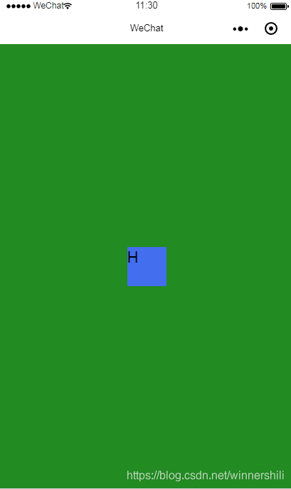
page{ height: 100%; background-color: forestgreen; display: flex; flex-direction: column; justify-content: center; align-items: center;}view{ width: 100rpx; height:100rpx; background: #436EEE;}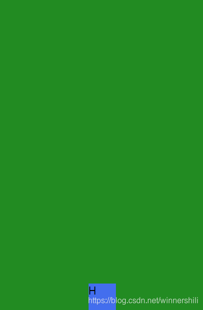
page{ height: 100%; background-color: forestgreen; display: flex; flex-direction: column; justify-content: flex-end; align-items: center;}view{ width: 100rpx; height:100rpx; background: #436EEE;}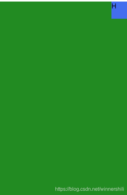
page{ height: 100%; background-color: forestgreen; display: flex; flex-direction: column; justify-content: flex-start; align-items: flex-end;}view{ width: 100rpx; height:100rpx; background: #436EEE;}
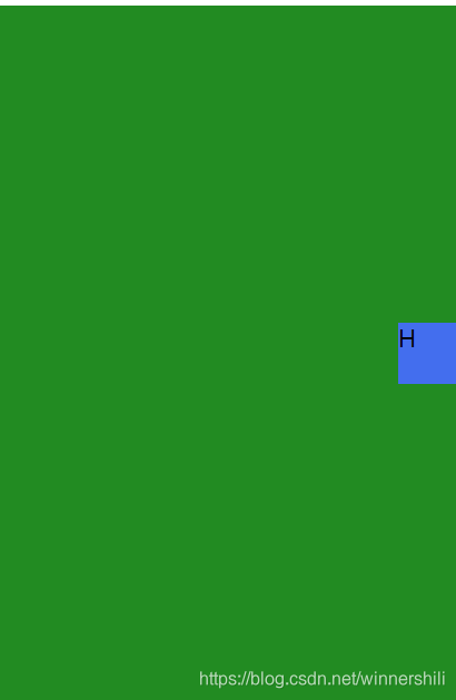
page{ height: 100%; background-color: forestgreen; display: flex; flex-direction: column; justify-content: center; align-items: flex-end;}view{ width: 100rpx; height:100rpx; background: #436EEE;}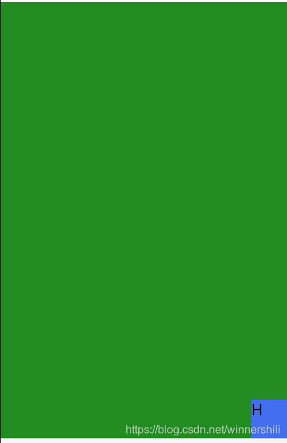
page{ height: 100%; background-color: forestgreen; display: flex; flex-direction: column; justify-content: flex-end; align-items: flex-end;}view{ width: 100rpx; height:100rpx; background: #436EEE;}如果切换到row方向 则属性相反
微信小程序