官方文档
目录
一.布局基础
1.flex的容器元素
2.flex容器属性
2.1 flex-direction
2.2 flex-wrap
2.3 justify-content
2.4 align-items
3.flex元素属性
3.1 flex-grow
3.2 flex-shrink
3.3 flex-basis
3.4 flex
3.5 order
3.6 align-self
4.相对布局
5.绝对布局
一.布局基础
flex布局 ( display:flex )
1.flex的容器元素
2.flex容器属性
| 属性名称 | 作用 | 取值 |
| flex-direction | 决定元素的排列方向 | colum、row(默认) |
| flex-wrap | 决定元素如何换行(排列不下时候) | warp、nowarp(默认)、warp-reverse |
| flex-flow | flex-direction和flex-wrap的简写 | 略 |
| justify-content | 元素在主轴上的对齐方式 | center、flex-start、flex-end、space-around、space-between ...... |
| align-items | 元素在交叉轴上的对齐方式 | flex-start(默认)、flex-end、center、stretch、baseline ...... |
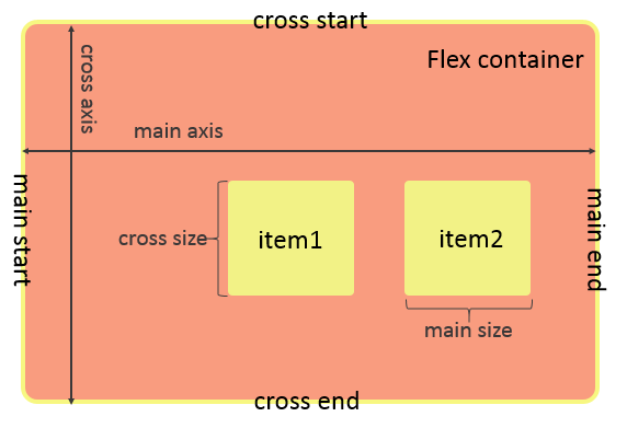
TIPS:
flex-direction 决定了主轴和交叉轴,colum→从上到下是主轴;row→从左到右是主轴
flex-flow 是简写,属性值中间用空格连接
效果图:
2.1 flex-direction
display: flex;flex-direction: row;
display: flex;flex-direction: column;
2.2 flex-wrap
display: flex; flex-wrap: wrap;
display: flex;flex-wrap: nowrap;
display: flex;flex-wrap: wrap-reverse;
2.3 justify-content
display: flex;justify-content: center;
display: flex;justify-content: flex-end;
display: flex;justify-content: flex-start;
display: flex;justify-content: space-around;
display: flex;justify-content: space-between;
2.4 align-items
display: flex; justify-content: space-between; align-items: flex-start;
display: flex; justify-content: space-between; align-items: flex-end;
//以第一行文字对齐,给第三个小方块加了特效display: flex;justify-content: space-between;align-items: baseline;
此时再将align-items设为flex-start,可以清晰的观察出其本质区别

3.flex元素属性
| 属性名称 | 作用 | 取值 |
| flex-grow | 当有多余空间时,元素的放大比例 | 0(默认)...其余数值(放大倍数) |
| flex-shrink | 当空间不足时,元素的缩小比例 | 1(默认)...其余数值(缩小倍数) |
| flex-basis | 元素在主轴上占据的空间 | 数值,单位px |
| flex | grow、shrink、basis的简写 | 略 |
| order | 定义元素的排列顺序 | 1 2 3 4...顺序数值 |
| align-self | 定于元素自身的对齐方式 | flex-start、flex-end、center |
3.1 flex-grow
flex-grow: 1;
.item{ flex-grow: 1;}.item2{ flex-grow: 2;}
3.2 flex-shrink
flex-shrink: 1;
.item{ flex-shrink: 1;}.item2{ flex-shrink: 0;}
3.3 flex-basis
flex-basis: 200px;
3.4 flex
flex: 1 1 50px;
3.5 order
<view class='container'> <view class='item' style='order:2'>1</view> <view class='item' style='order:3'>2</view> <view class='item' style='order:4'>3</view> <view class='item' style='order:1'>4</view></view>
3.6 align-self
.container{ ... align-items: flex-start;}.item{ ...}.item2{ align-self: flex-end;}
4.相对布局
精髓:相对定位的元素是相对自身进行定位的,参照物是自己
/* 为第二个元素设置了特殊样式 */position: relative;left:50rpx;top:70rpx;
5.绝对布局
精髓:绝对定位的元素是相对离它自己的一个已定位的父级元素定位的
/* 为第二个元素设置了特殊样式 */ position:absolute; left:50rpx; top:70rpx;<view class='container'> <view class='item'>1</view> <view class='item2'>2</view> <view class='item'>3</view> <view class='item'>4</view></view>//!!!当父级元素也没有定位,就以整个页面为参照
/*当父级元素已经定位了*/.container{ position: absolute; left: 80rpx; top:100rpx}/* 为第二个元素设置了特殊样式 */.item2{ position:absolute; left:50rpx; top:70rpx;}
谢谢浏览,如有错误烦请指正,喵喵喵~ (≧∀≦)ゞ
微信小程序