一个小程序的基本目录结构如下图:
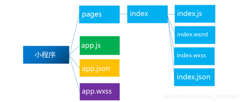
project
├── pages
| ├── index
| | ├── index.json index 页面配置
| | ├── index.js index 页面逻辑
| | ├── index.wxml index 页面结构
| | └── index.wxss index 页面样式表
| └── log
| ├── log.json log 页面配置
| ├── log.wxml log 页面逻辑
| ├── log.js log 页面结构
| └── log.wxss log 页面样式表
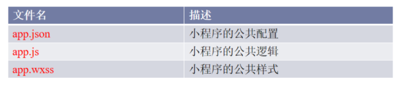
├── app.js 小程序逻辑
├── app.json 小程序公共设置
└── app.wxss 小程序公共样式表
1、界面底部的导航栏效果:
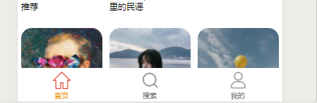
在app.json利用开发环境提供的组件tabBar即可完成:
"tabBar": { "color": "#707070", "selectedColor": "#ea9518", "backgroundColor": "#fff", "borderStyle": "white", "list": [ { "pagePath": "pages/Mainpage/Mainpage",//tabar对应哪一个个页面 "text": "首页",//标题 "iconPath": "/resource/主页2.png",//图标来源 "selectedIconPath": "/resource/主页 1.png"//选中后更换的图标来源 }, { "pagePath": "pages/search/search", "text": "搜索", "iconPath": "/resource/放大镜2.png", "selectedIconPath": "/resource/放大镜 1.png" }, { "pagePath": "pages/home/home", "text": "我的", "iconPath": "/resource/我的2.png", "selectedIconPath": "/resource/我的 1.png" } ] },
2、界面中常用的轮播图片:

在微信小程序中,构建轮播图片非常简单,只需要用小程序中的组件swiper即可
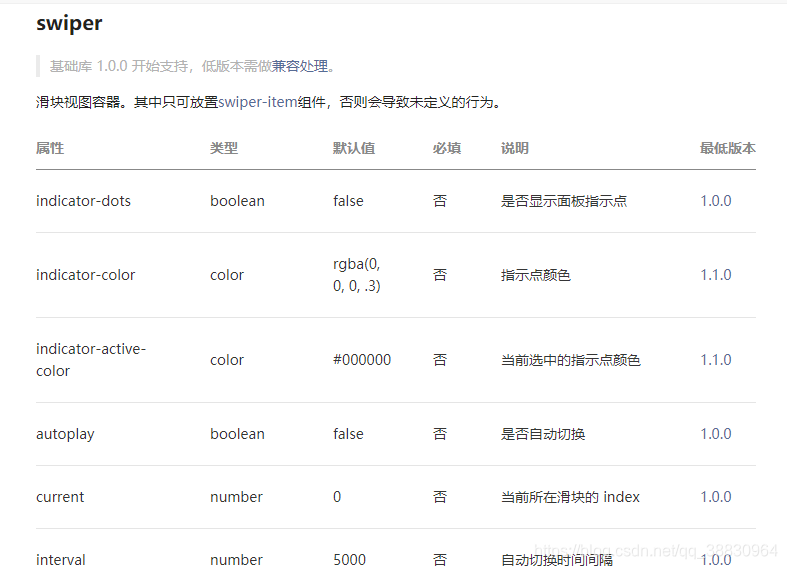
代码格式为:
<swiper> //轮播容器 <swiper-item>//轮播项 <image src=""></image>//轮播图 </swiper-item></swiper>每一个swiper-item对应一个轮播项,有时我们需要的轮播图较多,通常将图片存到数组中,用循环将其取出。
微信小程序的循环格式为:wx:for="{{数组名}}"
<swiper class='item' autoplay='true' interval='4000' circular='true' indicator-dots='ture' indicator-color='rgba(0,0,0,0.3)' indicator-active-color='red'> <swiper-item wx:for="{{imglist}}"> <image src='{{item.imgurl}}'></image> </swiper-item> </swiper>
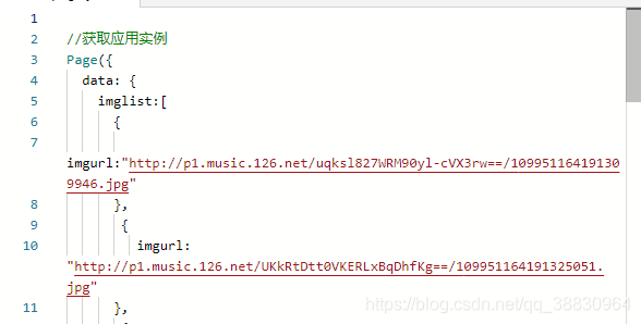
通常我们将数组写在js中的初始数据data中
官方文档链接:https://developers.weixin.qq.com/miniprogram/dev/component/swiper.html
可参考修改轮播图、指示点等的样式。
3、可拉动导航栏效果:
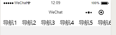
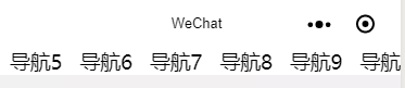
通过小程序组件scroll-view即可实现
<scroll-view scroll-x="true"> //scroll-x表示横向拉动,使用scroll-y可竖向拉动 <view class="nav"> <view>导航1</view> <view>导航2</view> <view>导航3</view> <view>导航4</view> <view>导航5</view> <view>导航6</view> <view>导航7</view> <view>导航8</view> <view>导航9</view> <view>导航10</view> <view>导航11</view> <view>导航12</view> <view>导航13</view> <view>导航14</view> </view></scroll-view>官方文档链接:https://developers.weixin.qq.com/miniprogram/dev/component/scroll-view.html
官方文档说的十分详细。
微信小程序